How to Pick a Kitchen Tile Backsplash That Works With Custom Cabinets
The backsplash is the last surface to go in and the first one the eye lands on. This guide walks through matching tile scale, grout color, and material to your cabinet finish family — so the millwork stays the star.
By Green Cabinets NY Team
Key Takeaways
- Ceramic tile has a 60-year service life per the Tile Council of North America while kitchen cabinetry lasts up to 50 years per the National Association of Home Builders, so select backsplash only after cabinets are fully specified.
- Specify cabinet door style, finish, and color first, then choose tile that complements the millwork instead of letting an Instagram backsplash dictate wood species and hardware.
- The best long-term backsplash material depends on moisture exposure, cleaning methods, and maintenance alongside the cabinets, not on the tile's hardness at installation.
- Never let the backsplash become the star of a custom kitchen, as bold statement tile routinely reduces precision joinery and wood grains to a mere backdrop.
The backsplash should never be the star of your kitchen. And if you've installed custom cabinets, making it one is a mistake you'll regret every single morning. The design world is saturated with advice urging homeowners to go bold, go dramatic, go statement-tile. But bold backsplash choices routinely overwhelm the craftsmanship of custom millwork, reducing hand-selected wood grains and precision joinery to a backdrop for glorified wallpaper. The best ideas for kitchen tile backsplash are almost always the ones that know when to step back.
The Tile Council of North America assigns ceramic tile a 60-year service life, while the National Association of Home Builders places kitchen cabinetry at up to 50 years. When both materials are expected to serve decades, pairing them shouldn't be guesswork. The Domus Surfaces analysis of generational home materials found that "the best long-term material is not always the one that is hardest on the day it is installed" — durability depends on product quality, installation, moisture exposure, cleaning methods, and maintenance. That means your backsplash choice lives or dies on how it interacts with the cabinetry beside it, not on the tile's spec sheet alone. Green Cabinets NY builds custom kitchen cabinets designed to last decades, and the backsplash selected to complement that millwork needs to hold up under the same timeline.
Why the Backsplash Decision Belongs After Your Cabinets Are Spec'd
Design sequencing kills more kitchens than tile selection. Homeowners pick a backsplash they fell in love with on Instagram, then try to find cabinets that "go with" it. By the time the cabinet order is placed, the backsplash has dictated the wood species, the finish, the door profile, and the hardware. The tail is wagging the dog.
The correct sequence reverses that logic. Cabinet door style, finish, and color drive backsplash selection. The cabinetry is the permanent, high-investment layer. The backsplash is the replaceable, expressive layer. When the relationship runs in that direction, the kitchen ages gracefully. When it runs backward, the homeowner is locked into a tile choice that constrains every future cabinet refresh.
Green Cabinets NY walks clients through this order during the design consultation. The team specs the cabinet finish family first (painted, stained, or natural wood), then narrows the door profile, then selects hardware. Only at that point does the backsplash conversation begin. By then, the tile palette has been narrowed organically by every prior decision, and the choices that remain are the ones that actually fit.
Custom kitchen cabinets represent a 50-year investment; the backsplash is the one element you can swap in a weekend. Designing the permanent layer first means the replaceable layer can adapt to trends without touching the millwork.
This sequencing matters most in NYC layouts, where cabinet runs are tight and sightlines are unforgiving. A Brooklyn galley kitchen puts the backsplash at eye level, directly behind the stove, visible from the living area. There's nowhere to hide a bad pairing. The cabinet-to-backsplash relationship is the entire visual story.
The cost of custom kitchen cabinets reflects the labor and material investment in that permanent layer. Spending that budget and then subordinating it to a $15-per-square-foot tile is a design inversion that shows up the moment the install is complete. When a homeowner invests in kitchen cabinets custom built for their specific space, the backsplash needs to honor that investment, not undermine it with a pattern that screams louder than the joinery beside it.
Step 1. Identify Your Cabinet Finish Family
Every cabinet finish falls into one of three families: painted, stained, or natural wood. Each family narrows the backsplash palette in specific, predictable ways. Understanding which family your cabinets belong to is the first filter that eliminates half the tile showroom from consideration.
Painted Cabinets Open the Palette
Painted cabinets (white, navy, sage, black) are a neutral canvas. They invite bolder tile choices because the cabinetry itself isn't competing for attention. A handcrafted zellige tile in deep ochre or a glossy ceramic in cobalt can sing against painted shaker doors without overwhelming the space. The paint provides a clean, flat backdrop that the tile can layer on top of.
The risk is overdoing it. Painted cabinets don't need a loud backsplash to create interest. The paint color itself is already the design statement. Pairing a saturated cabinet color with an equally saturated tile produces visual noise. The rule: if the cabinet color is bold, the tile should be quiet. If the cabinet color is quiet (white, cream, soft gray), the tile has room to speak.
For homeowners exploring darker painted finishes, the guide to styling black kitchen cabinets in NYC homes covers how to balance a strong cabinet color with complementary surfaces. Black cabinets paired with a light, reflective backsplash (white subway, cream ceramic, polished marble-look porcelain) create contrast and depth. Black cabinets paired with dark tile create a cave.
Stained Cabinets Want Earth Tones
Stained cabinets (walnut, cherry, mahogany, oak) carry their own color story. The wood grain is visible through the stain, which means the backsplash needs to respect that grain rather than fight it. Stained walnut pairs well with warm-toned tiles: terracotta, cream, warm gray, soft black. Stained oak works with tans, warm whites, and muted greens. The stain color itself becomes the color anchor, and the tile should sit within two to three shades of that anchor.
Stained cabinets are unforgiving with cool-toned tile. A blue-gray backsplash against warm walnut stain creates a temperature clash that reads as "something's off" even when the individual elements are beautiful. Stay on the warm side of the palette, or go neutral (true white, true gray) and let the stain carry all the warmth.
Natural Wood Demands Restraint
Natural wood cabinets (clear-coated maple, quartersawn oak, birch, rustic hickory) are the most demanding finish family to pair with a backsplash. The wood grain, color variation, and figure are the entire design story. Any tile that competes with that story is a mistake.
Natural wood calls for the quietest backsplash in the showroom. White subway tile in a neutral grout. Cream ceramic. Solid-color porcelain in a matte finish. The backsplash should function as negative space. The visual rest between upper and lower cabinets. Not as a second focal point.
Natural wood cabinetry is the one scenario where the backsplash should be invisible. The millwork is the art. The tile is the frame.
For specific wood species and their natural color profiles, the walnut species page and the quartersawn oak page from Green Cabinets NY show the grain and color range that the backsplash needs to respect. Walnut's chocolate tones want warm creams and soft grays. Quartersawn oak's ray fleck pattern wants the simplest possible tile. Anything busy creates visual competition between two textured surfaces.
Step 2. Match Tile Scale to Cabinet Door Profile
Cabinet door profile dictates tile scale. This is a proportion rule, not a style preference. Get the scale wrong and the kitchen reads as cluttered or flat, even when every individual element is well-chosen.
Flat-Panel and Shaker Doors Want Large-Format Tile
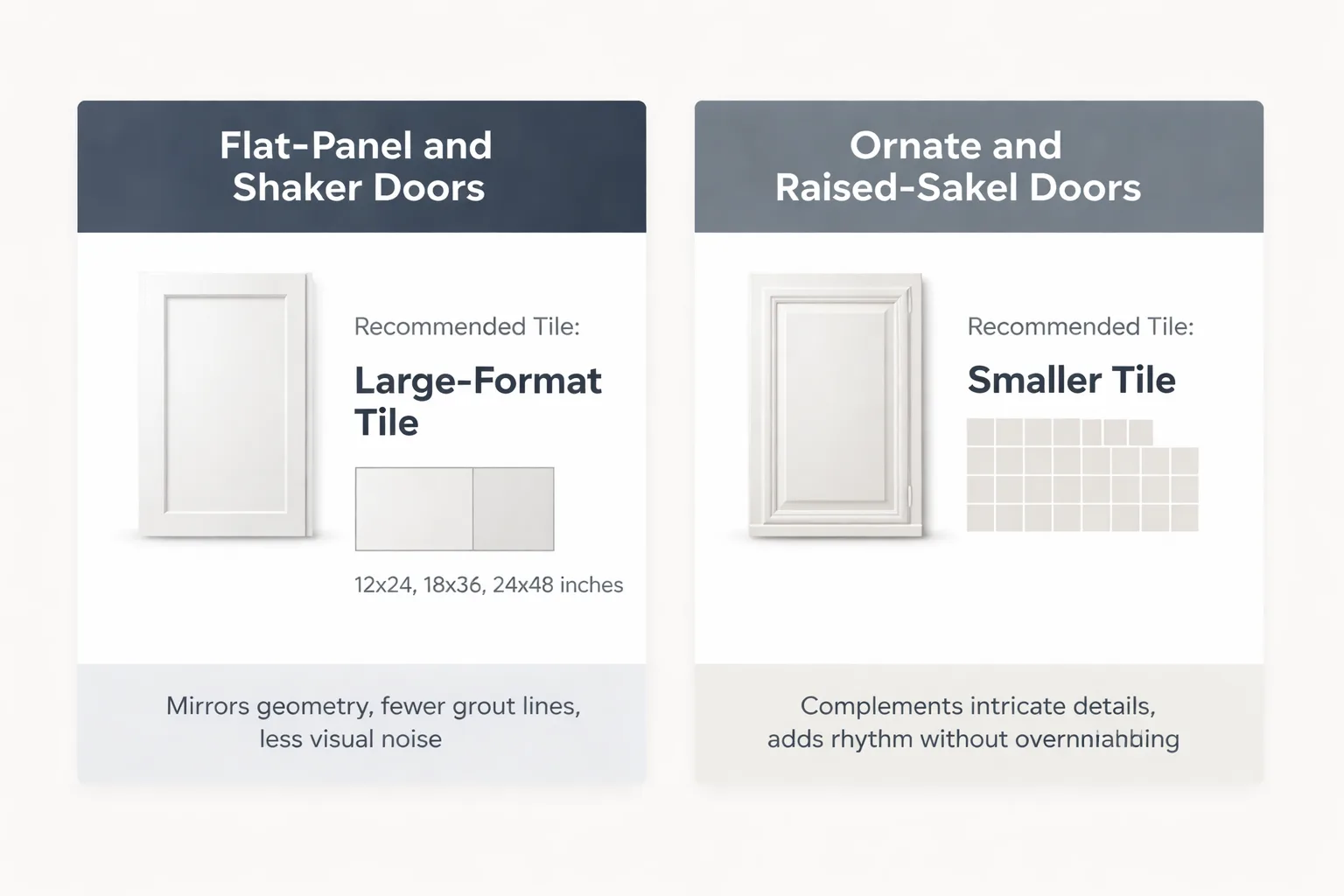
Flat-panel (slab) doors and Shaker doors share a clean, geometric simplicity. Their stiles and rails are wide, flat planes with minimal ornamentation. Large-format tiles (12x24, 18x36, 24x48) mirror that geometry. The tile lines run long and uninterrupted, echoing the cabinet door's horizontal emphasis. The result is a kitchen that feels calm and architectural.
Large-format tile also means fewer grout lines, which means less visual noise. When the cabinet doors are doing the work of creating rhythm through their stiles and rails, the backsplash doesn't need to add more rhythm through dense grout lines. The tile's job is to recede.
Ornate and Raised-Panel Doors Want Smaller Tile
Raised-panel doors, applied-molding doors, and other traditional profiles carry more visual detail per square foot. They have shadow lines, curves, and profiled edges. Small-format tile (subway, mosaic, 2x2, penny round) provides a texture that complements rather than competes with that detail. The grout lines create a grid that harmonizes with the door's traditional geometry.
The proportion rule: tile size should be proportional to door detail. More door detail = smaller tile. Less door detail = larger tile. A Shaker door with a 2-inch flat recessed panel and a 2.25-inch stile wants a 12x24 or larger tile. A raised-panel door with a decorative edge profile and applied molding wants a 3x6 subway or smaller.
Break the Rule Only With Intent
The one exception that works: pairing large-format tile with ornate doors when the intent is contrast. A traditional raised-panel door in a Brooklyn brownstone can look striking against a single slab of book-matched marble-look porcelain. The contrast is the point. But this is a deliberate design move, not a default. It requires a confident eye and a clear reason.
Step 3. Test Grout Color Against Cabinet Hardware
Grout is the most overlooked element in backsplash selection. Homeowners spend weeks choosing tile and thirty seconds choosing grout. The tile installer shows up with two options (gray and white), the homeowner picks one, and the kitchen lives with that decision for the next decade.
Grout color matters because it sits directly between the tile and the cabinet hardware in the visual field. It creates a line that connects (or disconnects) the two surfaces. Get it right and the kitchen feels coordinated. Get it wrong and the backsplash reads as a separate element bolted onto the wall.
Dark Grout With Matte Black Hardware
Matte black cabinet pulls and knobs are the most popular hardware finish in NYC kitchens right now. Dark grout (charcoal, graphite, black) creates a visual line that connects the hardware to the backsplash. The eye reads the dark grout and the dark hardware as part of the same design system. This works particularly well with white subway tile, where the dark grout creates a graphic grid that the black hardware anchors.
The risk: dark grout shows more variation over time as it ages, and it can make a small kitchen feel tighter. In a Brooklyn galley kitchen, dark grout on all walls may be too much. Consider dark grout behind the range (the feature wall) and light grout on the perimeter counters.
Light Grout With Brushed Brass or Bronze
Brushed brass and bronze hardware bring warmth. Light grout (warm white, bone, soft gray) lets that warmth flow into the backsplash without interruption. The grout becomes invisible, and the tile + hardware read as a continuous warm surface. This pairing works with natural wood cabinets, stained cabinets, and painted cabinets in warm tones (cream, sage, warm white).
Grout color should echo the hardware finish, not the tile color. Matching grout to tile creates a flat, monolithic surface. Matching grout to hardware creates a coordinated design system.
The Sample Board Test
Before committing, build a sample board. Tape a cabinet door sample, a hardware pull, a tile sample, and a grout color swatch to a piece of foam core. Hold it in the actual kitchen at different times of day. Northern light, southern light, overhead LED, under-cabinet lighting. Each changes the color relationships. A grout that looks perfect under showroom LEDs can look green under a north-facing window.
Green Cabinets NY provides finish samples for exactly this purpose. The maple species page and the birch species page show how those light-toned woods interact with hardware and surface materials. Maple's tight, even grain takes paint beautifully and pairs with a wide range of hardware and grout combinations. Birch's pale, even tone wants warm grout and warm hardware to avoid looking cold.
What cabinet finish are you pairing your backsplash with?
Top Backsplash Ideas for Brooklyn and NYC Kitchens in 2026
The backsplash trends circulating in NYC renovations this year share one quality: they respect the cabinetry beside them. None of these tiles demand to be the star. Each one works because it understands its role.
1. Handcrafted Zellige Tile
Zellige is hand-cut terracotta tile from Morocco, finished with a glossy glaze that varies from piece to piece. The variation is the point. No two tiles are identical, and the surface catches light differently across the wall. Zellige works with painted Shaker cabinets (white, navy, sage) and with stained oak. The handmade irregularity softens the crisp lines of Shaker doors.
The catch: zellige is porous. The LX Hausys analysis of quartz backsplash advantages notes that non-porous engineered surfaces offer practical benefits over porous tile in high-splash zones. Zellige behind a sink or range needs sealing and resealing. In a NYC kitchen with aggressive cleaning habits, zellige may stain. Use it on a feature wall behind a range, not behind the sink.
2. Fluted Ceramic Tile
Fluted ceramic (reeded or ribbed tile) adds vertical texture without adding color. The reeds create shadow lines that shift with the light, giving the backsplash dimension without pattern. This tile pairs with flat-panel cabinets, where the tile's vertical reeds echo the door's slab geometry. It also works with Shaker, where the fluted texture adds a layer of detail that the simple door profile can carry.
Fluted ceramic is the 2026 trend that aligns with the fluted cabinetry detail trending in Brooklyn design. Pairing fluted tile with fluted cabinet door inserts creates a coordinated texture story. The key is keeping the color palette restrained. Fluted white ceramic with white painted cabinets, or fluted cream with natural oak.
3. Terrazzo-Look Porcelain
Terrazzo-look porcelain large-format tile gives the visual interest of terrazzo without the maintenance burden of real terrazzo. Porcelain is non-porous, doesn't need sealing, and withstands the aggressive cleaning agents common in NYC households. The chip-and-fleck pattern adds visual texture without competing with wood grain.
This tile works with painted cabinets in muted tones (gray, greige, soft green) and with stained cabinets in mid-tone woods (oak, cherry). The terrazzo pattern picks up the secondary colors in the cabinet finish, tying the surfaces together. Avoid pairing terrazzo-look porcelain with natural wood cabinets. The tile's busy pattern fights the wood's grain.
4. Classic Subway Tile (Done Right)
Subway tile is not a trend. It's a standard. But in 2026, the way to use subway tile is with intention: larger format (4x12 or 4x16 instead of 3x6), stacked vertically or in a straight stack instead of brick pattern, and with grout color chosen to echo the hardware.
Subway tile pairs with every cabinet style. That's its strength and its weakness. Done without intention, it reads as default. Done with a deliberate layout and grout choice, it reads as considered. The guide to sustainable kitchen cabinetry from Green Cabinets NY emphasizes material longevity over trend-chasing, and subway tile is the backsplash equivalent of that philosophy: it won't date itself.
5. Slab Backsplash (Quartz or Porcelain)
A slab backsplash runs the same material as the countertop up the wall, eliminating grout lines entirely. This is the cleanest possible backsplash and pairs with flat-panel cabinets in modern kitchens. The slab creates a continuous surface that makes the cabinetry float.
Quartz slab backsplashes are non-porous and maintenance-free, which the LX Hausys analysis highlights as a practical advantage over tile. The tradeoff is cost. A full-height quartz slab backsplash runs significantly more per square foot than tile, and the material cost compounds quickly in a NYC kitchen with 30+ square feet of backsplash wall.
A slab backsplash with flat-panel cabinets is the one pairing where the backsplash genuinely disappears into the architecture. No grout, no pattern, no competition. The cabinet doors become the entire visual story.
6. Thin Brick Veneer
Thin brick veneer gives the texture of exposed brick without the structural work of exposing an actual brick wall. It pairs with painted Shaker cabinets in white or cream, creating the Brooklyn brownstone aesthetic that's been consistent for a decade. The brick adds warmth and history; the painted cabinets add crispness and modernity.
Thin brick wants light grout (warm white or bone) and matte hardware. Dark grout with thin brick creates a heavy, dark wall that overwhelms painted cabinets. Keep the grout light to let the brick's texture do the work.
7. Marble-Look Porcelain
Marble-look porcelain large-format tile gives the veining of marble without marble's porosity and staining issues. It pairs with painted cabinets in white, gray, and navy, and with stained cabinets in cool-toned woods. The veining adds movement without adding color, which means it can sit beside busy cabinet grain without competing.
The key is choosing a porcelain with realistic veining. Cheap marble-look porcelain has repetitive patterns that read as fake from across the room. Look for tiles with multiple print patterns per box (ideally 6+ distinct patterns) to avoid the wallpaper effect.
How Does Cabinet Material Affect Backsplash Choice?
The wood species selected for custom cabinetry influences the backsplash in two ways: color temperature and grain intensity. These are not cosmetic details. They are structural design constraints that determine which tile materials will harmonize and which will clash.
Hard Maple and Birch Want Cool, Clean Tile
Hard maple and birch are pale, tight-grained species that read as almost white with a faint cream undertone. They take painted finishes beautifully, but in their natural state, they want a backsplash that stays in the cool-to-neutral range. White subway tile, cool gray porcelain, or a white slab backsplash all work. The danger zone is warm-toned tile against these pale woods: a terracotta or warm cream backsplash can make natural maple look washed out, as if the cabinet color is trying to warm up and failing. If the goal is warmth, bring it through the hardware and the floor, not the backsplash.
Walnut and Cherry Demand Warmth in the Tile
Walnut and cherry carry deep, warm undertones (chocolate, reddish-brown, amber). A cool gray backsplash against walnut creates the same temperature clash as a blue tile against a warm stain. These species want backsplash materials that sit in the warm neutral family: cream ceramic, warm white subway, limestone-look porcelain, or a warm-toned slab. The walnut species page from Green Cabinets NY shows the depth of color that the backsplash needs to complement, not compete with. A slab of warm-veined quartz running behind walnut cabinets creates a continuous, rich surface that feels intentional.
Rustic Hickory and Alder Can Handle Busier Tile
Rustic hickory and alder are the exception to the "natural wood demands restraint" rule. These species carry so much natural color variation (hickory's blonde-to-brown range, alder's knot structure and warm tone) that a backsplash with moderate pattern can actually complement the wood's character. A terrazzo-look porcelain with warm chips, or a subtle encaustic pattern in muted tones, can work against hickory where it would overwhelm maple. The wood is already busy; the tile can echo that energy rather than trying to calm it down. The rustic hickory species page and the alder species page show the grain character that allows for a more expressive backsplash.
What About Sustainable Cabinet Materials and Backsplash Pairings?
Sustainability in cabinetry has moved from a niche preference to a mainstream priority, and the backsplash needs to align with that material philosophy. When a homeowner selects eco-friendly cabinetry, the backsplash shouldn't be a material that off-gasses, requires harsh chemical sealants, or ends up in a landfill in 10 years.
The guide to sustainable bathroom vanities for NYC homes from Green Cabinets NY covers the material resilience question in depth, and the same logic applies to kitchen backsplashes. A sustainable cabinet built from FSC-certified wood with low-VOC finishes wants a backsplash material that shares that lifecycle thinking. Ceramic tile, which the Tile Council of North America rates at a 60-year service life, is inherently sustainable because its longevity eliminates replacement cycles. Porcelain and quartz slab backsplashes share that durability profile.
The pairing mistake to avoid: combining a sustainable, low-VOC cabinet with a backsplash adhesive or grout that introduces volatile organic compounds into the kitchen. Specify low-VOC or epoxy grout for the backsplash install to maintain the air quality integrity of the sustainable cabinetry. The material chain is only as clean as its weakest link.
Stock vs. Custom Cabinets: Why Does the Backsplash Decision Differ?
The backsplash selection process changes depending on whether the cabinetry is stock, semi-custom, or fully custom. The level of design control the homeowner has over the cabinet finish, door profile, and hardware directly determines how deliberate the backsplash pairing can be.
Stock cabinets come in predetermined finishes and door profiles. The homeowner selects from a catalog, which means the backsplash is being matched to a fixed set of cabinet variables. This limits the tile palette but simplifies the decision: the cabinet is a known quantity, and the tile either works with it or doesn't. There's no co-design process to align the two surfaces.
Semi-custom cabinets offer more flexibility in finish and door style but still operate within a manufacturer's system. The homeowner can adjust dimensions and select from a broader finish range, but the wood species and construction method are fixed. The backsplash has slightly more room to play, but the cabinet's character is still largely set by the manufacturer.
Fully custom cabinets, like those built by Green Cabinets NY, give the homeowner complete control over wood species, finish, door profile, and hardware. This is where the backsplash pairing becomes a genuine design decision rather than a matching exercise. The cabinet and backsplash can be designed in tandem, with the tile selection informed by the specific grain, color, and proportion of the cabinetry being built. The beech species page demonstrates the level of material specificity that custom cabinetry enables. A pale, fine-grained hardwood that takes stain uniformly and pairs with a precise backsplash color that a stock cabinet line couldn't accommodate.
The custom kitchen cabinets cost reflects the ability to co-design the cabinet and backsplash as a system. Stock cabinets force the backsplash to adapt. Custom cabinets let the two surfaces evolve together.
How Does Lighting Change the Backsplash-Cabinet Relationship?
Lighting is the variable that invalidates every rule in this article if it's ignored. A tile-and-cabinet pairing that looks perfect in a showroom can fail in a specific kitchen because the light source changes the color temperature, contrast, and visual weight of both surfaces.
North-Facing Kitchens: The Cool Light Problem
North-facing kitchens in Brooklyn brownstones receive indirect, cool-toned daylight throughout the day. This light pushes warm tile colors toward gray and makes warm wood tones look muddy. A zellige tile in warm ochre that looks radiant under showroom LEDs can read as dull brown under north-facing light. The solution: either commit to cool-toned tile (white, gray, blue-gray) that harmonizes with the light, or introduce warm under-cabinet lighting (2700K LED tape) that corrects the color temperature at the backsplash surface. The tile and the lighting need to be specified together, not sequentially.
South-Facing Kitchens: The Overexposure Risk
South-facing kitchens receive direct, warm daylight that can wash out subtle tile texture and make glossy tile surfaces produce glare. A high-gloss zellige or polished marble-look porcelain can create uncomfortable reflections under direct southern light, especially at eye level behind the range. Matte or honed tile surfaces perform better in these conditions. The cabinet finish also matters: painted white cabinets in a south-facing kitchen can look flat and overexposed, while a stained or natural wood cabinet holds its depth under the same light.
Under-Cabinet Lighting: The Great Equalizer
Under-cabinet LED lighting is the single most effective tool for controlling the backsplash-cabinet relationship. It provides consistent, directional light on the tile surface regardless of the kitchen's orientation. Specify dimmable LED tape (2700K-3000K) under every upper cabinet run. This gives the homeowner control over the backsplash's appearance at night and on cloudy days, decoupling the tile's visual performance from the natural light conditions. The tile and the lighting should be specified in the same design phase, not after the install.
When This Process Fails
This process assumes the homeowner is working with a cabinet finish and door profile that are already decided. When the cabinets are still in flux. Finish undecided, door profile changing, hardware not yet selected. The backsplash selection process collapses. There's nothing to match against. The tile gets chosen in a vacuum, and when the cabinets finally land, the pairing is accidental.
This process also fails when the homeowner has a tile they're emotionally attached to before the design consultation begins. A client who walks in with a specific hand-painted Portuguese tile they found on a trip to Lisbon has already made the backsplash decision. The cabinet design is now subordinate to that tile, and the process runs backward. Sometimes the result is beautiful. More often, the cabinetry is compromised to accommodate a tile that doesn't fit the kitchen's architecture.
Finally, this process fails in kitchens with no natural light. North-facing Brooklyn kitchens with small windows get so little daylight that tile color and grout color read completely differently than they do in the showroom. A white subway tile that looks clean and bright under retail lighting can look gray and flat in a north-facing kitchen. The sample board test mitigates this, but some homeowners skip it because they're eager to move forward. That eagerness costs them.
FAQ
Can I install a backsplash before my custom cabinets are delivered?
No. The backsplash must be installed after the cabinets are set in place. The countertop goes in first, then the backsplash tiles against the countertop and the cabinet underside. Installing tile before cabinets means the tile edge won't meet the cabinet properly, leaving gaps that require filler strips or caulk. The sequencing is: cabinets, countertop, backsplash. Always.
How do I choose grout color if I haven't picked hardware yet?
Pick hardware first. Hardware is a permanent decision (drilling holes in cabinet doors and drawers), and the grout should echo the hardware finish. If hardware is genuinely undecided at the backsplash stage, default to a neutral grout (warm white or soft gray) that works with most hardware finishes. Avoid bold grout colors until the hardware is locked in.
What's the most low-maintenance backsplash for a busy NYC kitchen?
Large-format porcelain tile or a quartz slab. Both are non-porous, don't require sealing, and withstand aggressive cleaning. The LX Hausys analysis of quartz backsplash advantages highlights non-porosity as the key practical benefit. Porcelain large-format tile gives the same benefit at a lower material cost, with the tradeoff of grout lines (fewer with larger format).
Should my backsplash match my countertop or my cabinets?
Neither, exactly. The backsplash should coordinate with both, but matching either creates a flat, monolithic look. The backsplash's job is to bridge the countertop and the upper cabinets visually. If the countertop is busy (veined stone), the backsplash should be quiet. If the countertop is quiet (solid quartz), the backsplash has room for texture or subtle pattern.
How much does a tile backsplash installation cost in NYC?
Tile backsplash installation in NYC typically runs $40-100 per square foot installed, depending on tile material and complexity. Mosaic and handmade tile (zellige) sit at the high end. Large-format porcelain sits at the low end. This is separate from the custom kitchen cabinets cost, which is the larger budget line item. The Kitchen Search cost guide provides context on the cabinetry investment that the backsplash budget should be proportional to.
What tile works best behind a gas range in a NYC kitchen?
Behind a gas range, the backsplash needs to withstand heat, grease, and frequent cleaning. Non-porous large-format porcelain or a quartz slab are the best performers. Porcelain is rated for high heat resistance and won't stain from grease splatter. Avoid porous natural stone (travertine, tumbled marble) behind a range unless you're committed to annual sealing. Zellige can work behind a range if it's sealed properly, but the uneven surface makes grease cleanup harder.
How do I pair a backsplash with fluted cabinet doors?
Fluted cabinet doors (reeded or ribbed door fronts) carry vertical texture that echoes the fluted ceramic tile trend. The safest pairing is fluted white ceramic tile with fluted white painted cabinet doors. The texture is coordinated and the color is restrained. Avoid pairing fluted tile with fluted cabinets in different colors; the texture alignment becomes visually noisy when the colors don't match. If the cabinet doors are fluted in a warm wood tone, pair with a smooth, flat tile to provide visual rest.
The backsplash is the last surface to go in and the first one the eye lands on. Treat it as the finishing layer of a cabinet design system, not as a standalone decision. Green Cabinets NY designs the cabinet system first, then helps clients select the backsplash that completes it. That order is the difference between a kitchen that feels designed and a kitchen that feels assembled. The best ideas for kitchen tile backsplash don't compete with the cabinetry. They complete it.
Get the cabinet-to-backsplash pairing right the first time. Book a design consultation with Green Cabinets NY and spec your millwork before the tile.